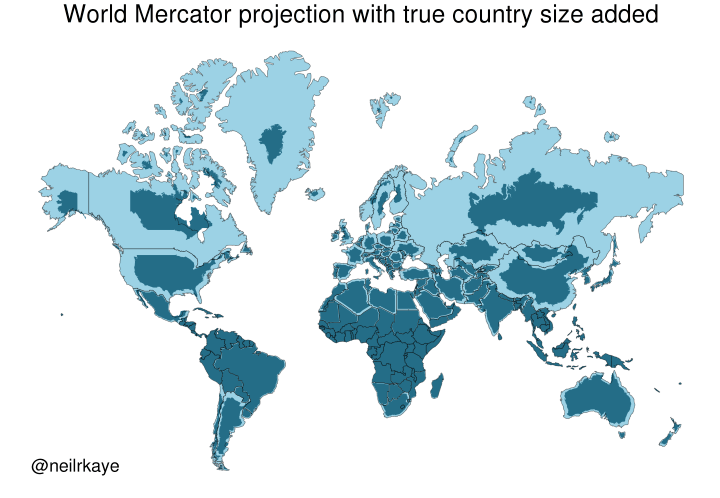
Yet another reason to tut at the Mercator map projectionhttps://brilliantmaps.com/mercator-vs-true-size/
-
Yet another reason to tut at the Mercator map projection
https://brilliantmaps.com/mercator-vs-true-size/@infobeautiful it all depends on what the purpose of the map is.
-
@Osteopenia_Powers @stevefaeembra @x_tof @infobeautiful
Not sure if this is the link you wanted to post.
@lokjo
Thanks, I'll fix it.
@stevefaeembra @x_tof @infobeautiful -
@infobeautiful it all depends on what the purpose of the map is.
@edgeofeurope @infobeautiful Indeed. I feel that the anti-Mercator abuse neglects what the projection is good for, and what practical problem it was invented to solve.
-
Yet another reason to tut at the Mercator map projection
https://brilliantmaps.com/mercator-vs-true-size/A very bad graphic. The point is taken but that map is very inaccurate. Eg the Canadian southern border should fit perfectly with the USA but it is shrink way too much. There are much better maps which account for there projection errors.
-
Yet another reason to tut at the Mercator map projection
https://brilliantmaps.com/mercator-vs-true-size/What this map shows is that America's penis (Florida) is much smaller than Americans think.
-
@infobeautiful Very useful to see. Done by a professional, so I must be wrong, but where I am (north New Zealand) is at about the same latitude as San Francisco, but we seem to be less shrunk?
Re discussion about more realistic projections, my favourite is Cahill-Keyes. http://www.genekeyes.com/world_map_poster.html
@quixote @infobeautiful I have a feeling that it looks this way because NZ is smaller so, though the percentage difference is about the same, the absolute difference is smaller and less obvious to the eye in this colour scheme – at first glance, I don't see the NZ area difference at all because the colours are so close. Which means that the map maybe wasn't really made by an especially expert expert. Or else that the colour scheme was chosen exactly for that reason: to show that the southern lands are mistakenly thought to be much much smaller than they really are, relative to the northern. My son's godparents had no idea how big New Zealand was until they came to visit us; they were initially planning their trip on the understanding that the whole country was about the size of New England. These are Ivy educated people, both PhDs, both academics. Even they fell for it.
The more interesting thing that I see on this map is how, because the latitudes are omitted, the area scaling looks so asymmetric – you can't see that the equator is markedly within the lower half rather than through the middle and a lot of people have little idea of where the equator is. I have a feeling that this is its primary intention.
Still, the primary point of the Mercator projection is that it's good for compass navigation. Our failure to teach this is the problem – hiding the purpose sets learners up to use maps inappropriately for their whole lives.
-
Fascinating, thanks!
Here's obligatory link to great bit from TV's "The West Wing." Where cartographers compare Mercator versus Peters projections for stunned C.J. and Josh.
The head map guy is played with perfect drollery by the invaluable John Billingsley (Star Trek: Enterprise; The Man from Earth, etc.).
Cartographer: "Nothing's where you think it is."
C.J: "Where is it?"
Cartographer: "I'm glad you asked…"@BobDevney @infobeautiful You can’t do that.
-
What this map shows is that America's penis (Florida) is much smaller than Americans think.
@bruce you beat me to it >.< @infobeautiful
-
Yet another reason to tut at the Mercator map projection
https://brilliantmaps.com/mercator-vs-true-size/@infobeautiful oh look how tiny #murica really is... just like his hands

-
Yet another reason to tut at the Mercator map projection
https://brilliantmaps.com/mercator-vs-true-size/@infobeautiful Someone please fwd this to trump
-
Yet another reason to tut at the Mercator map projection
https://brilliantmaps.com/mercator-vs-true-size/@infobeautiful "Yet another"? Isn't that the one reason why people keep tutting at it all the time?
(And, sadly, many probably think that Mercator is the only projection with this particular distortion or that there are ideal projections that don't distort anything.)
-
@quixote @infobeautiful I have a feeling that it looks this way because NZ is smaller so, though the percentage difference is about the same, the absolute difference is smaller and less obvious to the eye in this colour scheme – at first glance, I don't see the NZ area difference at all because the colours are so close. Which means that the map maybe wasn't really made by an especially expert expert. Or else that the colour scheme was chosen exactly for that reason: to show that the southern lands are mistakenly thought to be much much smaller than they really are, relative to the northern. My son's godparents had no idea how big New Zealand was until they came to visit us; they were initially planning their trip on the understanding that the whole country was about the size of New England. These are Ivy educated people, both PhDs, both academics. Even they fell for it.
The more interesting thing that I see on this map is how, because the latitudes are omitted, the area scaling looks so asymmetric – you can't see that the equator is markedly within the lower half rather than through the middle and a lot of people have little idea of where the equator is. I have a feeling that this is its primary intention.
Still, the primary point of the Mercator projection is that it's good for compass navigation. Our failure to teach this is the problem – hiding the purpose sets learners up to use maps inappropriately for their whole lives.
@libroraptor @infobeautiful Indeed! I was surprised to hear that NZ is about the same size as California from top to bottom and side to side. They have a lot of nerve just constantly dropping us off world maps all the time, don't they?

-
Yet another reason to tut at the Mercator map projection
https://brilliantmaps.com/mercator-vs-true-size/@infobeautiful i’m definitely a fan of the Peters Projection.
I clearly remember a 🤯 moment from first or second grade when I saw it for the first time!
-
Yet another reason to tut at the Mercator map projection
https://brilliantmaps.com/mercator-vs-true-size/@infobeautiful
Which is which? Where's the key on this visualization? -
@infobeautiful i’m definitely a fan of the Peters Projection.
I clearly remember a 🤯 moment from first or second grade when I saw it for the first time!
@infobeautiful Pro tip: If you stretch Peter's projection "widescreen", it retains more of the shapes of the continents you are used to. (This might be my favorite world map)
-
@stevefaeembra @lokjo @x_tof @infobeautiful
This one substitutes the Prime Meridian for the equator. (Hilarity ensues)@Osteopenia_Powers @stevefaeembra @lokjo @x_tof @infobeautiful
Finally a map with a biblically accurate Australia -
@infobeautiful Very useful to see. Done by a professional, so I must be wrong, but where I am (north New Zealand) is at about the same latitude as San Francisco, but we seem to be less shrunk?
Re discussion about more realistic projections, my favourite is Cahill-Keyes. http://www.genekeyes.com/world_map_poster.html
@quixote @infobeautiful Here is a better Cahill-Keyes world map, without the extremely misleading overlaid rectangular grid. Instead, Justine actual geographic parallels and meridians are shown. (From Wikipedia: https://en.wikipedia.org/wiki/Cahill%E2%80%93Keyes_projection